Many clients asked, and now the option to change the colors of the charts in reports and dashboards is available.
We call it the Report Theme, and now when editing a report you can change the colors according to the available options.
There are two options:
- Change the entire report:
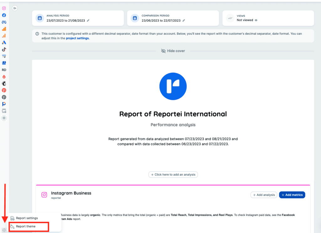
- Change a network/block individually
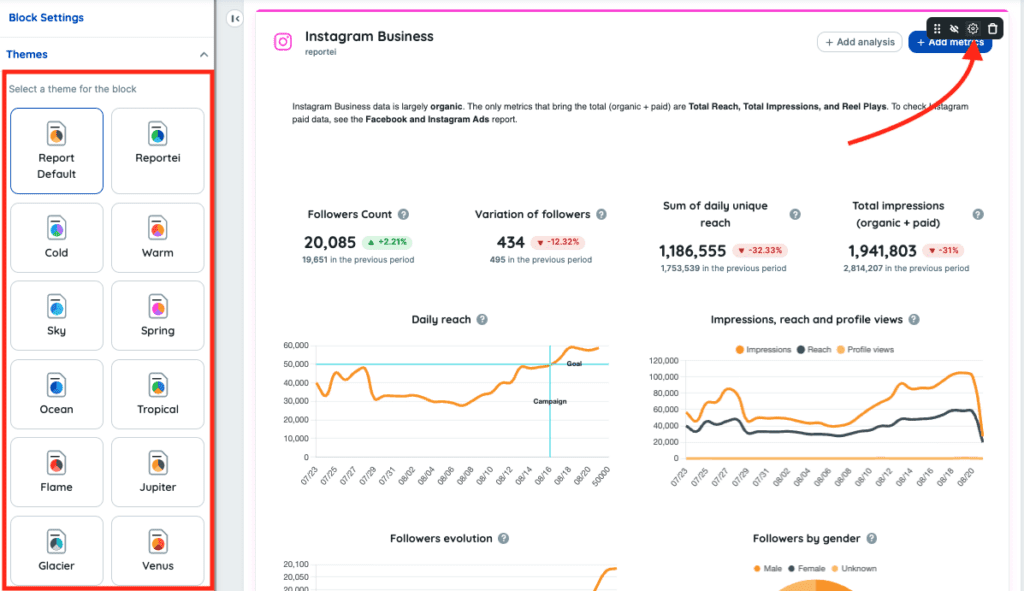
Important: there is a “hierarchy” between options 1 and 2. What is configured directly on the Block individually will always be respected.
This implies that, when you change the theme of a block/network individually and then change the theme of the entire report, the initial theme that was set on that individual block/network will be respected and maintained, and only the themes of the other networks in the report will change.
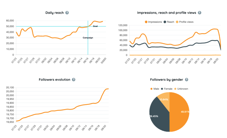
An example of how the color change applied to the charts looks like:
Cool, right?
If you have any questions, please contact our Support Team. =)