Explore all the features that Reportei offers for dashboard customization and create the ideal panels for each client
With the ability to customize metrics, charts, tables, and layout, Reportei dashboards easily adapt to the needs of each project, aiding in more efficient insights and analysis in your routine.
But if you’re not yet familiar with all the resources our platform offers for customizing your data and creating a more visually appealing panel, don’t worry. We’ve prepared this article to introduce them all. Stay tuned!
How to Customize Dashboards in Reportei?
Just like the reports automatically generated by Reportei, the dashboards created on our platform can also be customized. That is, you can use a variety of features and settings to make the panel more appealing for your team or client, making it easier to interpret results.
Below, we present features and tips to customize the dashboards for your projects and make even more efficient analyses in your routine. Let’s go?
Highlight the Most Important Results
The final stage of the funnel will always be the main focus for a more accurate analysis of the projects, whether by the analyst or the client. Therefore, it’s crucial for the dashboard to be structured to highlight this information first, before talking about mid and top-funnel data.
For this reason, Reportei allows you to change the order of channels and metrics to emphasize those that are most impactful, placing them at the forefront. This enables the team to make quicker and more efficient decisions based on what is most relevant for achieving marketing objectives.
Another interesting feature is that it’s now also possible to create a funnel within the channels. In graph format, it shows how each indicator contributes to the end result and helps understand how adopted strategies lead to business success. See the example below:
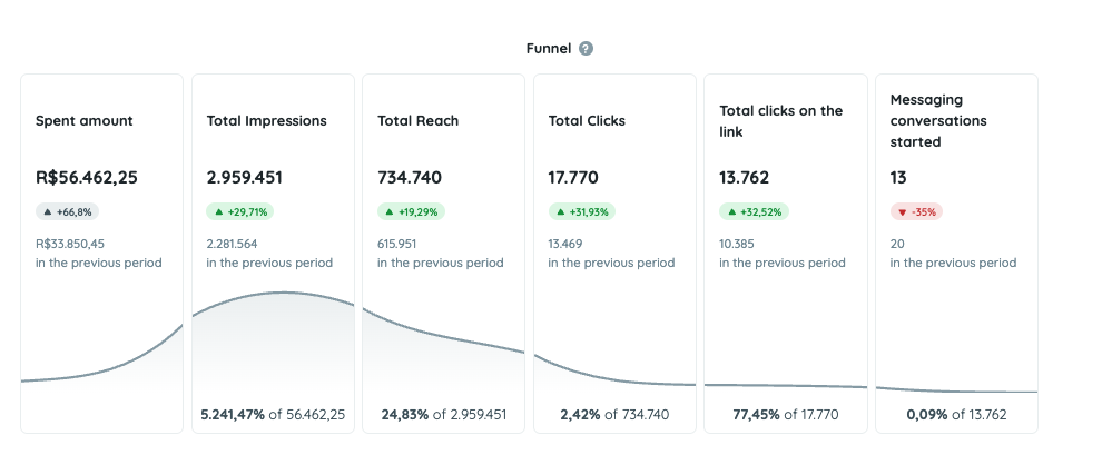
To start using marketing funnels in your analyses, simply click on the option “Add Metrics” and then select “Funnel”.
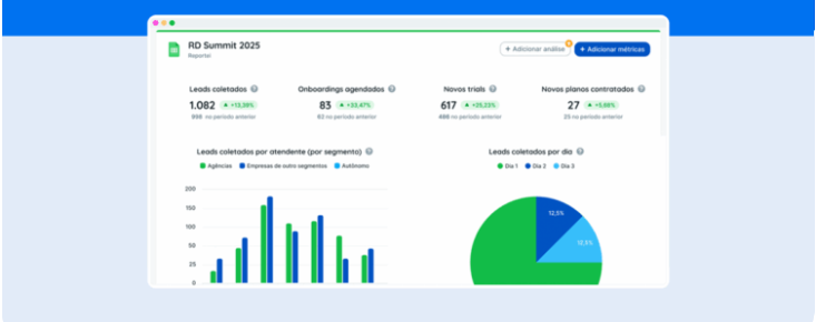
Add or Remove Metrics
Besides changing the order of metrics, another key feature of Reportei is the flexibility to include or exclude indicators from your report.
As you may already know, when generating your dashboard automatically, we offer a predefined format with the key data from integrated social media platforms. However, we understand that each project has its unique needs and requires a personalized analysis of the results.
Therefore, by selecting the option “Add Metrics,” which is located in the top right corner or the bottom bar of the report, you can include and analyze all the information relevant to your client that is not automatically included in the first generated model.
In addition, there’s also the option to add manual metrics to highlight some results that are important for your report but are not yet automatically captured by our tool.
Now, if you wish to eliminate some data that aren’t as relevant to the project’s progress, simply click on the trash icon located in the top right corner of each metric. This makes your dashboard simpler to analyze and more accurate.
Edit Tables and Charts
Metrics included in tables and charts can also be edited to make your dashboard data more aligned with the needs of the team or client.
In fact, for charts, you can create manual models and choose the format in which the information will be presented – column, line, or pie.
Another interesting point is that Reportei recently released the option to group data in charts that show results by weeks, months, and quarters, even if the pre-defined period is not that.
Add Analyses on Channels
Since the first editions of Reportei, open analyses offer a space for you to add your interpretations about the results and provide a broader view of the project to the team or clients.
The button to include an analysis is available both at the beginning and end of the dashboard, allowing you to add as many as needed to explain the reasons behind each strategy executed.
Moreover, there’s no need to only add text analyses. For instance, many of our clients opt for video analyses to remotely present data or images to supplement pertinent information.
Modify the Report Cover
Along with all the above changes, you can also customize the cover of the report or dashboard, making them visually reflect your brand. The process is quite simple; just access the “Header Settings” button in the top right corner of the document, as shown in the example below:
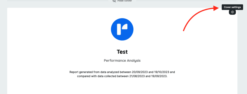
From there, a column with options will be available on the left side, allowing you to adjust models, text, logos, and themes.
The first option for creating a personalized cover for your report in Reportei involves choosing between models and text that will make up the header. This allows you to:
- Transform the header into a cover, making it a print-friendly A4 version;
- Separate the title and subtitle of the cover from the name of the dashboard, allowing you to customize these two texts according to the most relevant information;
- Decide whether to display the analysis period on the cover.
Next, you can opt to show or hide the company logo and choose the format in which it will be displayed, whether round, square, rectangular, or, if you prefer, insert a logo designed by your graphic designer.
Finally, you can modify the header theme of the dashboard to align it with your client’s brand colors. This allows for the change in background color of the cover and the text color present in the title, subtitle, and period of analysis.
Save the Template and Use Again
As you know, the dashboard’s purpose is to be a dynamic panel to facilitate analysis and decision-making. So, after customizing it, you can always access it in that format and simply navigate between different periods to understand the evolution of results.
However, this doesn’t mean that this model can’t be saved and used as a template for other projects. For that, simply click on the “Save as Template” button (available in the dashboard’s editing bar), select a title that helps identify the layout, and choose it later whenever you need to create a new metrics panel.
Create Dashboards in Reportei in Seconds
Now that you know all the customization possibilities for dashboards to adapt them to each project’s needs, there’s no reason not to leverage this feature in Reportei.
Register now and begin the customization process to make your work even more efficient and data-driven. After all, to make the most of Reportei’s potential, you have to take full advantage of the tool’s resources.
So, what are you waiting for? Explore Reportei today and optimize your marketing analyses!