Learn how to change your charts in Reportei for a more comprehensive visualization of data grouped by weeks, months, or quarters
When presenting a digital marketing report to a client, one of the most important steps is to demonstrate the project’s evolution and how it has generated good results for the company over time.
Therefore, one of the features that recently arrived at Reportei is the ability to group data in charts by weeks, months, and quarters, going beyond the initially stipulated period in the report.
In other words, even if you decide that the analysis should be for the last month, you can modify the charts to cover a longer period and see the development of the results more efficiently. Want to know how this feature works in practice and see examples of its application? Then check out everything in this article!
Data Grouping in Charts: How Does It Work?
Regardless of the analyzed channel, data grouping is now available in Reportei charts that include the “date” dimension. That is, charts that can demonstrate the evolution of metrics over weeks, months, or quarters.
Below, we explain how to adjust these charts and provide examples of how to apply this feature in your reports. Follow along!
How to Change Groupings in Charts?
To perform more advanced comparisons in your Reportei charts, just follow these steps:
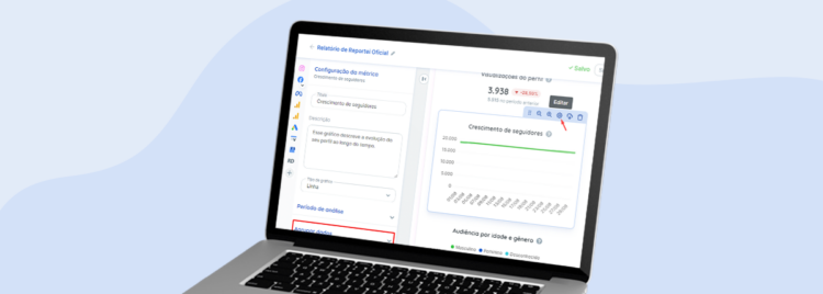
- Click on “Edit” (the gear icon) in charts with the “Date” dimension.
- In the tab that opens on the left side, select the “Group data” option.
- Then, choose whether you want to see the information by “Day,” “Week,” “Month,” or “Quarter.” Upon selecting the best option, the chart will automatically update to show a new set of data.
With this possibility, you can create charts to show evolution within the analyzed period in the report and add other comparatives to demonstrate the project’s evolution over the months, for example.
Data grouping is also available in manual charts, and soon, some options will also be released as standard templates, making your routine analysis even easier.
In addition to changing the data grouping, Reportei also allows changing the type of chart (line, bar, or pie) so you can choose the visualization that best suits the needs of your team and clients.
Examples of New Data Groupings in Charts
Below, we’ve selected some examples of how to use data grouping to demonstrate the evolution of results in different channels used in your strategies:
Social Media: Growth of followers or likes on Instagram, Facebook, TikTok, and other media. Even if the results in a particular month aren’t very significant, it’s possible to demonstrate the evolution over time, adding greater value to the project.
Paid Traffic: To demonstrate the values invested in the period, clicks on ads, and conversions achieved – which helps to get a more complete view of the relationship between your investments and the results obtained.
Marketing Automation: Conversions of leads, opportunities, and clients over time, showing the development of contact capture and sales in recent months, during the year, or since the client’s arrival.
Website Access: Whether measured in Analytics or organic results monitored by the Search Console, such as the relationship between clicks and impressions or between average ranking in Google and Click-Through Rate (CTR).
These are just a few examples of the application of data grouping in Reportei charts. But you can go further, as all integrations with charts that have the “date” dimension can have their information customized to meet the client’s needs.
See Other Ways to Customize Reports in Reportei
Along with data grouping in charts, Reportei also offers various other ways to customize reports and dashboards for each type of project. Check them out:
Adding Manual Metrics In addition to charts, you can also add manual metrics to complement the information if it is not automatically captured by the tool.
For example, the RD Station report generated on the platform captures lead conversions but not the number of unique leads generated. However, if you want to add this information, there is the possibility to do so manually.
Editing Tables
To define which data will be analyzed in the columns and rows, you can edit the tables according to the information that is most relevant for the project or for better understanding by the client.
Adding Analyses
Whether in text, images, or videos, you can add your perspective on the results obtained in the worked media. This makes communication with clients clearer and more effective, in addition to helping in the recording of a project history and future plans.
Choose from Pre-Defined Templates
Another interesting point is that you can also choose your template according to the type of project, with options focused on social media, paid traffic, inbound marketing, and e-commerce strategies.
By selecting this layout, you gain access to the most appropriate design for your client’s needs, following an order of channels and metrics most relevant to the business objective.
Of course, this doesn’t prevent you from making the modifications you deem necessary in the document, creating your own custom template. It’s just a way to expedite the process based on the most important strategies worked on in the project.
Moreover, after making customizations to the layout, you can save it to use as many times as you want later, whether with the same or other registered clients.
To access these and other features of Reportei, such as data grouping in charts, log in to your account now or try our 3-day free trial on our platform!
These are just a few examples of how data grouping can be applied in Reportei charts. But you can go beyond, as all integrations with charts that include the “date” dimension can have their information customized to meet the client’s needs.
To access these and other features of Reportei, such as data grouping in charts, log into your account now or take advantage of our 3-day free trial on our platform!