Learn all about Reportei’s dashboard design that stands out for its high flexibility and data customization
The dashboard design is an essential factor for the success of any digital marketing strategy.
After all, it is through a well-structured layout that agencies and professionals can visualize complex data clearly, objectively, and above all, functionally.
Therefore, when you choose a tool with a truly differentiated dashboard UI design, the routine of analysis and decision-making tends to become much more efficient.
In this text, we will explore how Reportei stands out compared to other platforms and why it has become the ideal solution for professionals who wish to optimize the way they monitor the performance of campaigns and strategies. Check it out.
The importance of good dashboard design for marketing analysis
In a highly competitive marketing environment, having a tool that provides clear and concise information is crucial to understand what works and what needs adjustment in campaigns.
Thus, a good dashboard design makes all the difference in this process. Among the benefits it offers, the following stand out:
- Clarity of information as an efficient dashboard layout logically groups information, facilitates access to the most important data, and allows you to focus on truly useful insights.
- Agility in decision making when data is presented intuitively, your team or clients can quickly visualize performance metrics. This accelerates the identification of strengths, weaknesses, and the optimization of campaigns.
- Better collaboration a design focused on usability encourages collaboration within teams. After all, it’s much simpler to share reports and insights when everything is organized and easy for everyone involved to understand.
- Professional image by presenting data in an organized and attractive manner to clients, you convey an image of professionalism and authority in what you do. And this certainly positively impacts the perception of your work or your agency.
Therefore, if you’re looking for a dashboard design site that offers practicality, flexibility, and customization, it’s essential to know more about the solutions that Reportei offers.
What are the differentiators of Reportei’s dashboard design?
Reportei was created to simplify the routine of agencies and digital marketing professionals
Thus, from the creation of automated reports to the presentation of complete dashboards, our platform stands out for its ease of use and the wealth of features it offers
Below you will find the main differentiators of the design of Reportei’s dashboard:
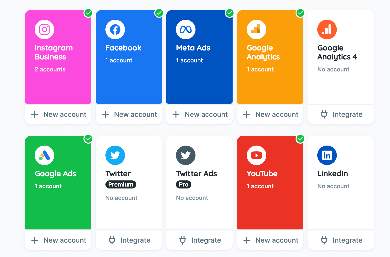
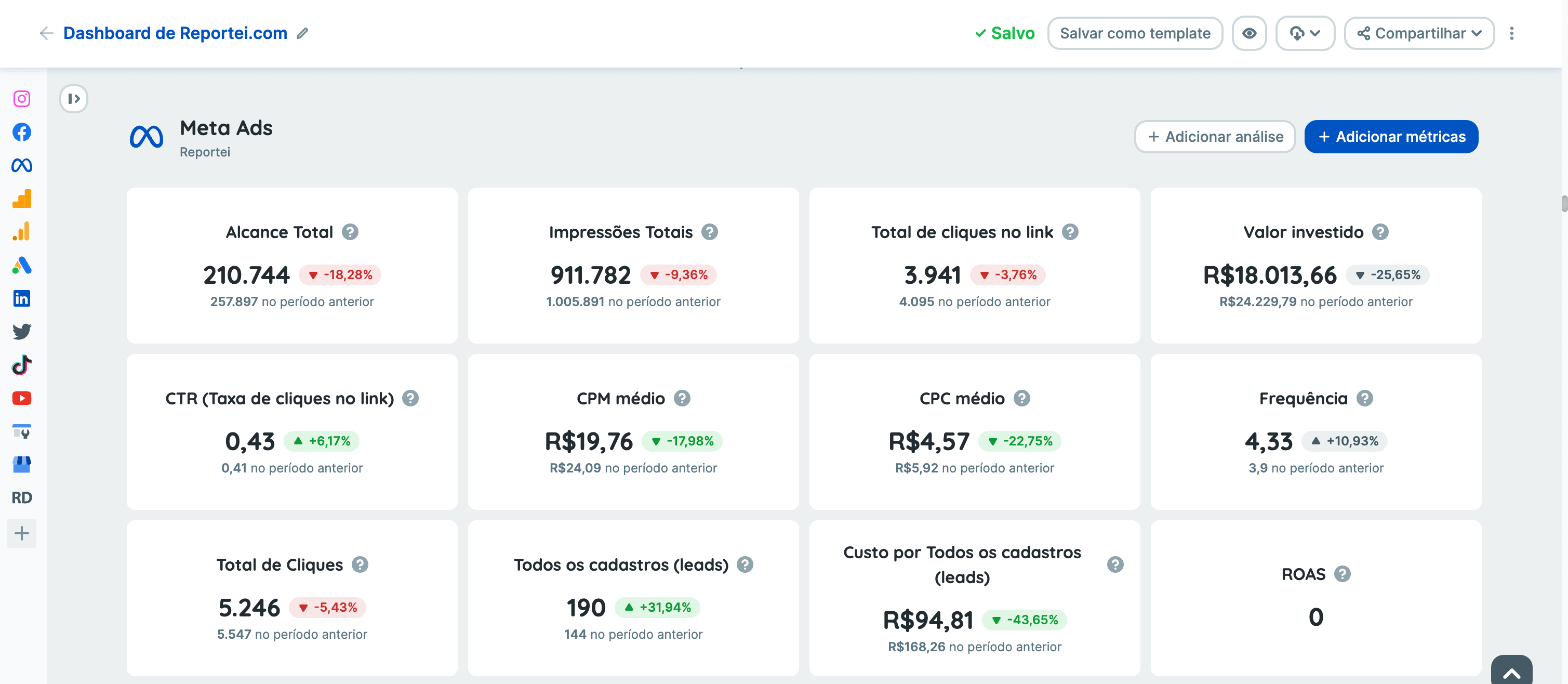
1. Analysis of all channels in a single panel
One of Reportei’s great strengths is allowing you to have the relevant metrics of all channels in a single panel that you manage.
In other words, you can access data from Google Ads, Analytics, Meta Ads, Instagram, YouTube, LinkedIn, among many others, all in one place.
Even better, you have total freedom to select and reorganize the order of channels valuing those that are most impactful for the strategy in question.
This translates into more agility when identifying which social media or platforms generate better results and where you need to focus your efforts to achieve the marketing goal.
2. Addition, removal, and organization of metrics
Flexibility and customization are the watchwords in Reportei’s dashboard design. That’s because, in addition to changing the order of channels, you can include or exclude metrics according to the needs of each project or client.
Initially, Reportei’s predefined panel already provides the main data from the integrated channels. However, each business is unique and requires a specific view of its data.
Therefore, it’s possible to add extra metrics that are not originally included in the dashboard or even remove those that do not make sense for the strategy.
And it doesn’t stop there, Reportei offers the option to add manual metrics that fall outside the scope of traditional tools
You know that specific data captured on another platform or developed internally in the company? You can easily insert it into your dashboard, making the analysis even more complete and customized
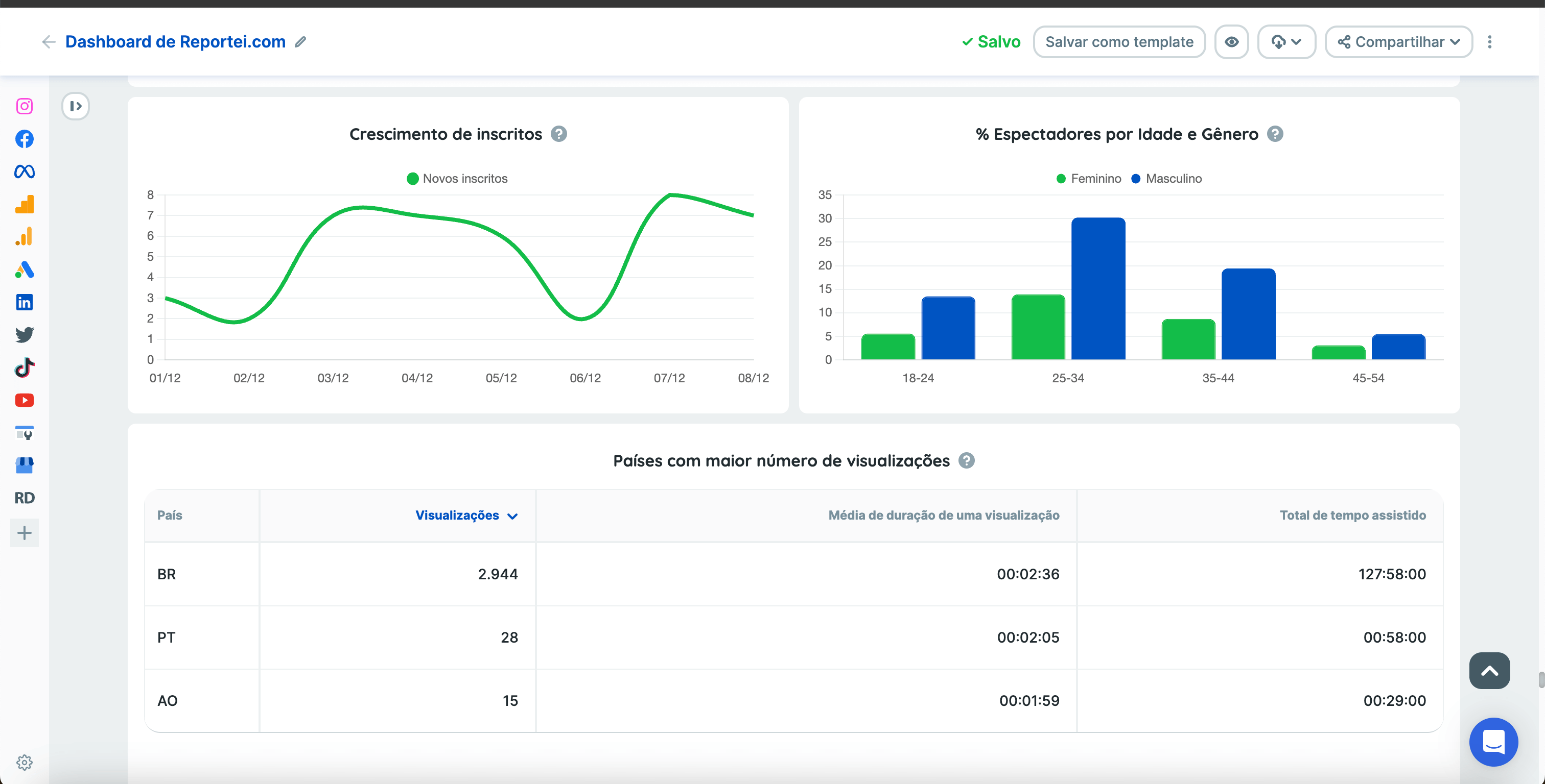
3. Practical editing of tables and charts
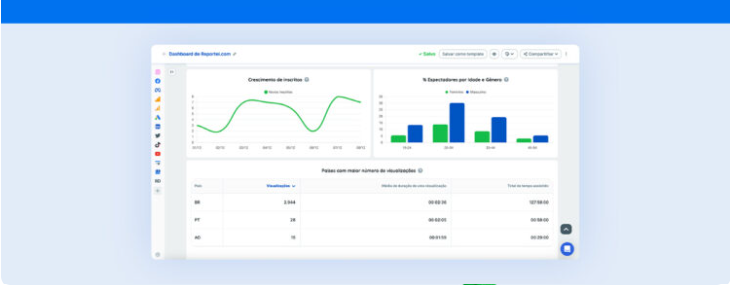
One of the most valuable characteristics in a dashboard layout is the ability to visualize information in various formats.
Tables and charts are usually essential to understand trends and comparisons, but sometimes they need to be adjusted to each strategy’s logic. Thus, in Reportei, the editing of these elements is quite intuitive and flexible.
Want to group data by week, month, or quarter? No problem. Even if the chosen period for the report is a specific interval, you can adapt how the chart presents the information bringing relevant insights about the growth or decline rate of the metrics.
Moreover, you can create manual charts and choose the format that best represents your data All this makes the visualization more appropriate to each project’s objectives, and the reading of results becomes much more efficient.
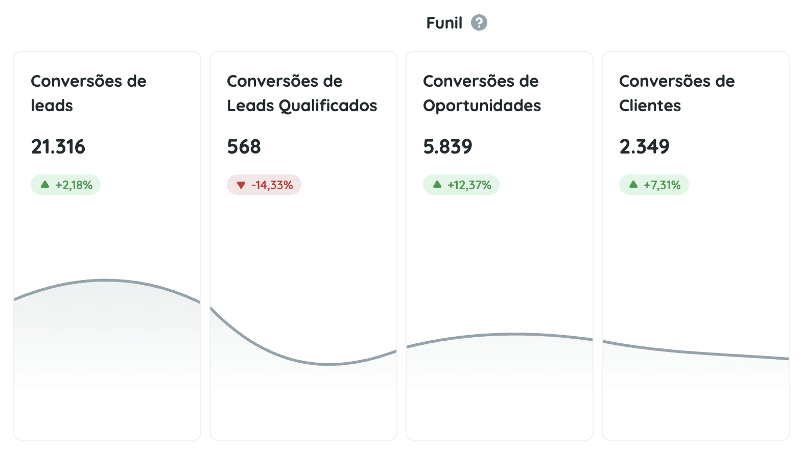
4. Marketing funnel analysis in the dashboard layout
For agencies and professionals who wish to have a deeper view of their leads’ or clients’ progress at each stage, funnel marketing analysis within the dashboard is extremely valuable.
After all, understanding how each indicator contributes to the business’s final result is essential to refine strategies and increase conversion rates.
In this way, Reportei enables the creation of a funnel within each channel in chart format showing the movement from one stage to another until conversion.
In other words, this functionality is essential to identify bottlenecks and improvement opportunities, as well as to present to the client the path being taken to success:
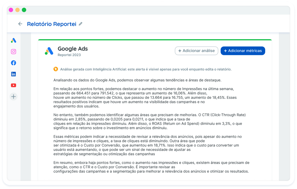
5. Addition of analyses on channels in different formats
Finally, one of the principles of good dashboard design is the ability to go beyond the simple presentation of metrics
For this, Reportei offers the so-called open analyses a space for you to add your interpretations and comments on the data.
This functionality raises the level of communication with clients and internal teams, as it allows you to contextualize results, explain strategy changes, or highlight growth opportunities
In addition to the text analyses done manually or by artificial intelligence you can also add videos and images
This freedom of choice enriches the data presentation and ensures that the most relevant information is communicated clearly, whether in an in-person meeting or a remote presentation:
Comparison with other dashboards
When it comes to dashboard design, it’s inevitable to compare solutions available in the market, such as Looker Studio, Excel, Cyfe, or Power BI.
Each tool has its positives, but Reportei stands out for offering practicality, efficiency, and excellent cost-benefit for agencies and marketing professionals who need agility in their daily activities. See the comparison:
- Looker Studio formerly Data Studio is robust and customizable, but it may require advanced technical knowledge for exploration and dashboard building.
- Excel is still an ally in many companies, but it wasn’t developed to create visual and interactive dashboards simply, which ends up requiring a lot of time for setup and formatting.
- Cyfe offers good monitoring options but usually requires more expensive subscriptions paid in dollars to access advanced features.
- Power BI powerful and complete, but also more complex and often with high costs for smaller companies, besides requiring technical training in data analysis;
In contrast, Reportei is a tool that combines simplicity of use, report automation, and a high level of customization.
This ensures that you don’t waste time with complex configurations and focus on what really matters: interpreting results and optimizing marketing strategies.
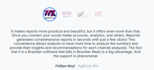
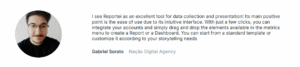
Testimonials from satisfied users
With all that said, there’s nothing better than knowing the opinion of those who already use Reportei. Various professionals and agencies highlight not only the ease of creating and editing dashboards but also the agility to obtain valuable insights. See examples below:
In other words, the testimonials confirm that the practicality and flexibility of Reportei contribute to agency growth and strategy optimization, showing that a good dashboard design is indeed a game changer.
Create dashboards on Reportei in seconds
After learning about all the differentiators of Reportei it’s time to see this ease in practice.
Just like reports dashboards can be generated in seconds which is perfect for those who need agility when obtaining insights and making marketing decisions.
Whether for daily, weekly, or monthly tracking Reportei’s dashboard layout adapts to your project’s demands.
In other words, if you are already a Reportei client, just access your account and enjoy all these customization features.
But if you are not yet, it’s worth testing the platform for 3 days for free and discovering how Reportei can revolutionize the way you create digital marketing dashboards.